
Author: Federico Olivieri
Color as a Market Signal
In the fashion world, changes are rarely just about style; they often kick off with shifts in color that signal a strategic pivot. A prime example is Bottega Veneta’s introduction of “Royal Blue,” led by designer Louise Trotter. This vibrant and striking shade, with its sophisticated hint of violet, sparked immediate interest in the market, showcasing how color can communicate more powerfully than words. While it may not be a groundbreaking shift, this “Royal Blue”,named to evoke the refined elegance of the British Royal Family, was cleverly integrated into the brand’s color palette to reinforce its upscale image. This launch underscores a key point: color is a vital asset in the luxury landscape.
Neuromarketing and the Economic Impact of Color
From a broader economic and marketing standpoint, color isn’t just a decorative element; it’s a cornerstone of brand identity that can boost brand recognition by as much as 80%. It serves as a universal language that directly influences sales metrics, shaping consumers’ subconscious buying choices.
Research in the industry reveals some striking statistics:
- 90% of subconscious buying decisions hinge on color perception.
- 93% of consumers view visual appeal (and thus color) as a key factor in their purchasing decisions.
- The first impression, formed in mere seconds, is influenced up to 90% by color.
Brands leverage these psychological insights to shape perceptions of value: black is associated with luxury and sophistication, blue conveys trust and professionalism, while red ignites energy and passion.
Standardization and Visual Consistency
To really get the most out of their visual identity, luxury brands stick to strict standardization policies. They often rely on the Pantone system to keep the “color code” consistent across all platforms, whether it’s physical packaging or digital ads. Having a well-defined color palette is key toachieving the visual consistency needed to create a seamless experience across various channels, like websites, social media, and retail spaces. This consistency is crucial for standing out from the competition and helping customers feel a sense of belonging and instant recognition.
Case Studies: Color as Corporate Asset
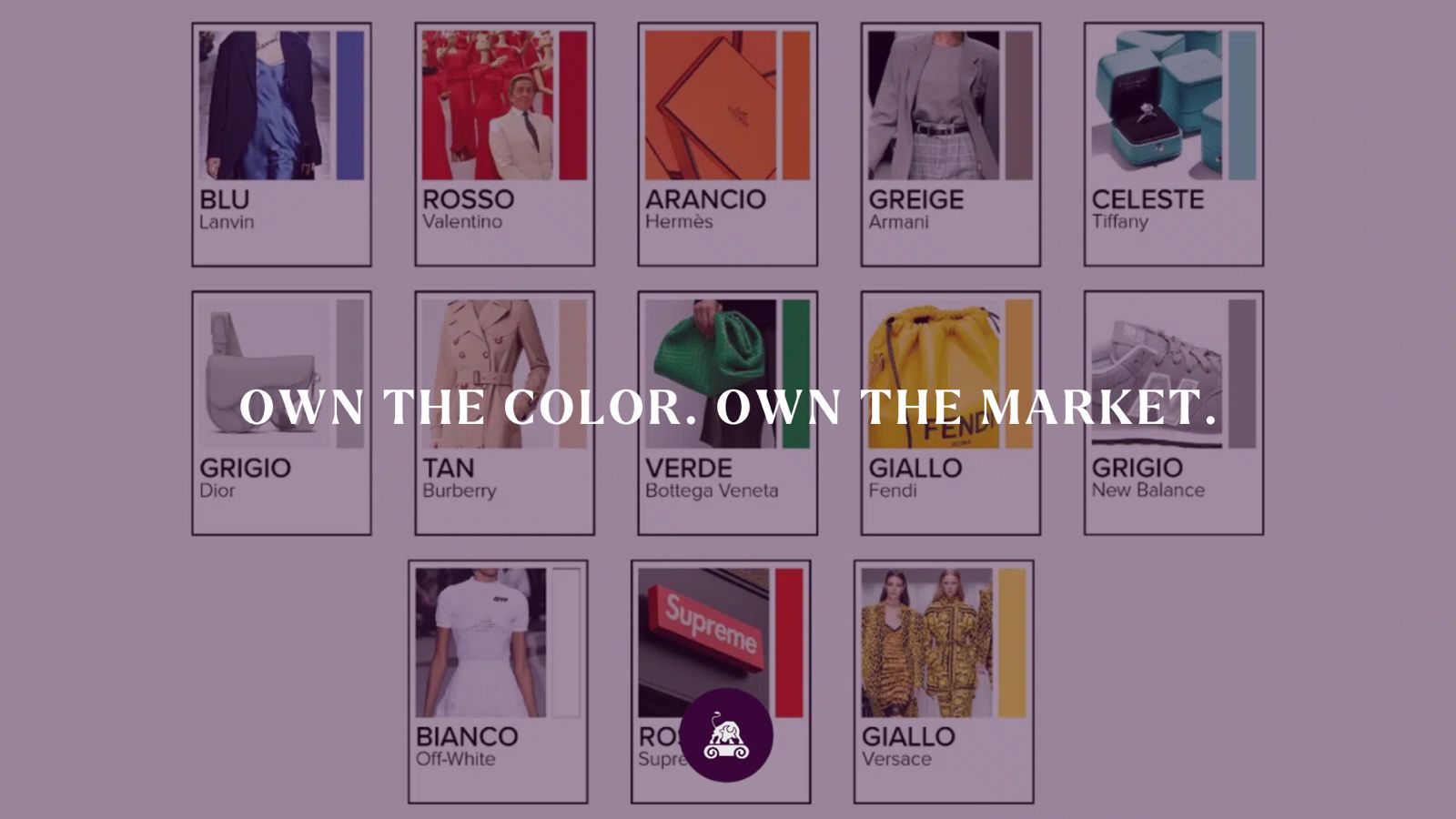
Many luxury brands have turned specific shades into true trademarks, sometimes through careful planning and other times by seizing unexpected opportunities. Here’s a look at some of the most iconic colors that have shaped the fashion industry’s economic landscape.
1. Hermès: The orange box and supply chain resilience
The famous Hermès orange is a prime example of how a brand can adapt strategically to external challenges. Initially, their packaging was cream or beige with a dark border. However, during World War II, they faced supply chain disruptions that made mustard-colored boxes unavailable. They had to switch to the only color they could get: orange. In the 1960s, they made this choice official by bringing back the dark border, turning a logistical necessity into the symbol of global luxury we now recognize as the “Orange Box.”
2. Tiffany & Co.: The value of exclusivity
“Tiffany Blue” (often mistaken for green) is actually a robin’s egg blue, a color chosen by founder Charles Lewis Tiffany back in the 19th century. Tiffany’s approach is all about scarcity and exclusivity: the Blue Box isn’t for sale and can’t leave the store without a piece of jewelry inside, thanks to strict corporate policies that have been in place since 1906. The color, which was trademarked in 1998 and officially recognized by Pantone as “1837 Blue” (the year the company was founded), carries such intrinsic value that it elevates the brand itself.
3. Valentino: Heritage and rebranding
The Valentino maison presents a fascinating case study. On one side, we have Rosso Valentino (Valentino Red), inspired by Garavani’s experiences at the opera in Barcelona. This color symbolizes elegance and female empowerment, becoming a core part of the brand’s identity. On the flip side, there’s the recent Pink PP, crafted by Pierpaolo Piccioli in collaboration with Pantone. This shade goes beyond mere aesthetics; it’s a bold “statement of intent” promoting inclusivity, and it plays a key role in a large marketing campaign aimed at attracting younger generations.
4. Giorgio Armani: The invention of “Greige”
Giorgio Armani introduced a new term to define his niche: greige. This perfect blend of grey and beige captures the essence of the brand, discretion, urban warmth, and subtle luxury. It visually represents a strategy designed to appeal to a clientele that values sophistication over showiness.
5. Bottega Veneta: The “Bottega Green”
Before the rise of Royal Blue, creative director Daniel Lee unveiled “Bottega Green.” This vibrant, almost surreal shade of green was boldly used on accessories like the Cassette bag and in packaging to generate immediate buzz. While its presence in collections has diminished, the iconic green shopping bag remains a powerful marketing tool and a symbol of brand recognition.
6. Gucci: “Rosso Ancora” and historical storytelling
Sabato De Sarno kicked off his creative journey by reviving “Rosso Ancora” from the archives. This heritage marketing move links the current offerings to the legacy of founder Guccio Gucci, including his time at the Savoy in London and the lining of the original Jackie bag. The name of the S/S 2024 collection, “Gucci Ancora” (Gucci Again), cleverly uses color to Invite customers to rekindle their love for the brand, tapping into nostalgia and authenticity to breathe new life into the label. The recent analysis, which looks at Bottega Veneta’s striking Royal Blue alongside the timeless appeal of Hermès orange, shows that in the luxury market, color has evolved from just a stylistic choice to a vital intangible asset. Nowadays, the real challenge for brands isn’t just about crafting an outstanding product; it’s about establishing a unique visual identity that serves as a cognitive “barrier to entry.” Whether it’s the sophisticated Armani Greige or the exclusive Tiffany Blue, long-term success hinges on the ability to turn subtle nuances into brand equity. In a world where attention is increasingly scarce, “owning” a color can provide a significant competitive edge, turning visual impressions into financial success and fostering brand loyalty.